SUNNY QUEEN FARMS ARCHITECTURE PROJECT
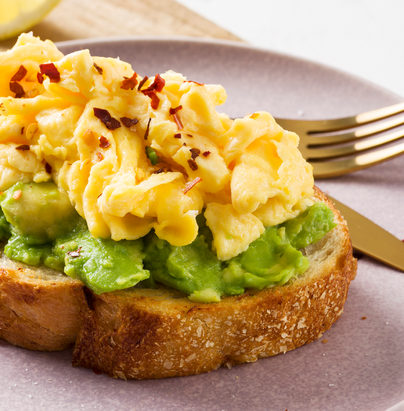
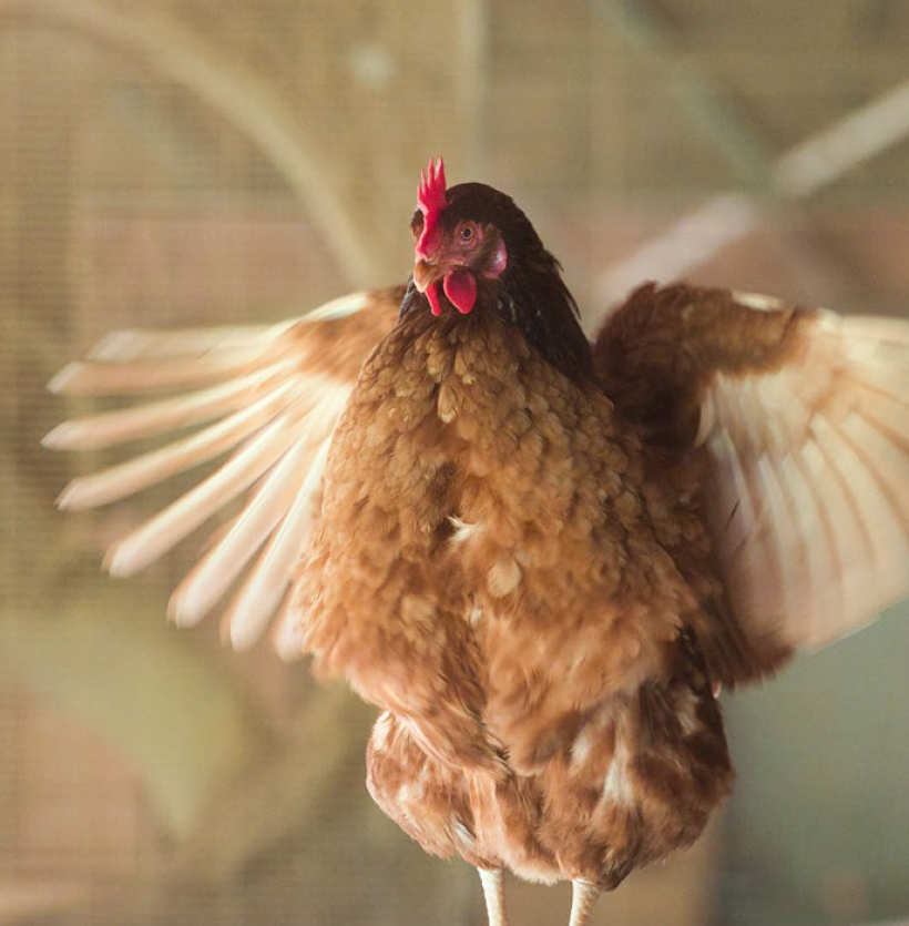
Sunny Queen Farms are an Australian farmer owned and operated company with over 85 years experience. They have exceptional farming practices and food safety standards and operate with the belief that well cared for hens lay the best quality eggs. Hen welfare is at the core of everything they do.
OUR TASK
The Sunny Queen Farms look and feel didn’t reflect their brand values or personality of authenticity, wellbeing and their innovative and cheeky personality traits. Neon was given the task of not only aligning the brand to their values, but also bringing NPD products into the portfolio with a strong architecture to align all Sunny Queen products now and in the future.
CORE BRAND REFRESH
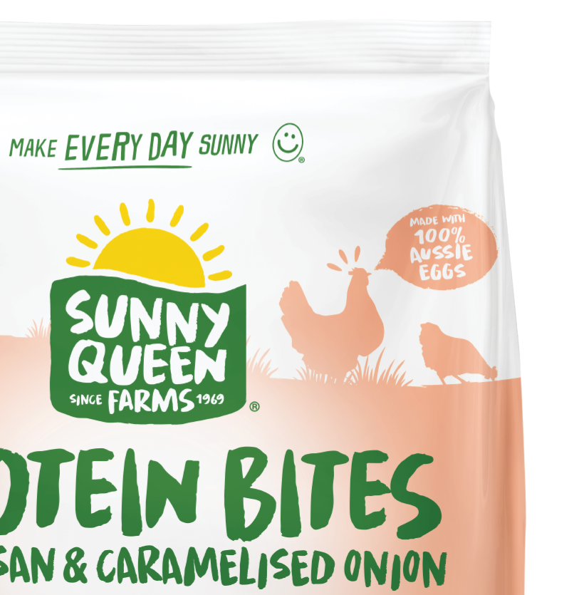
The Sunny Queen Farms logo was redesigned to align with core brand values and personality. The shiny gloss and old fashioned design was upgraded to reflect a more modern logo. A flattened style with dynamic colours to represent their sunshine and farm design.
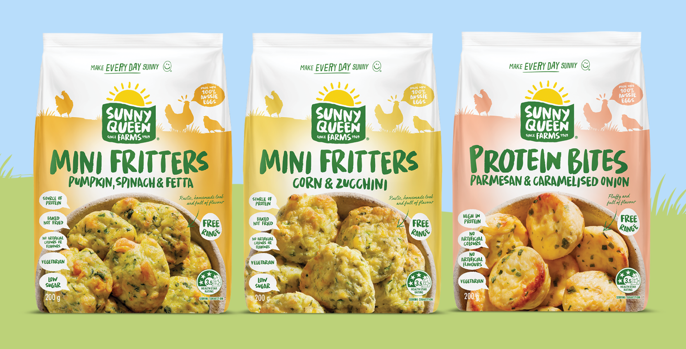
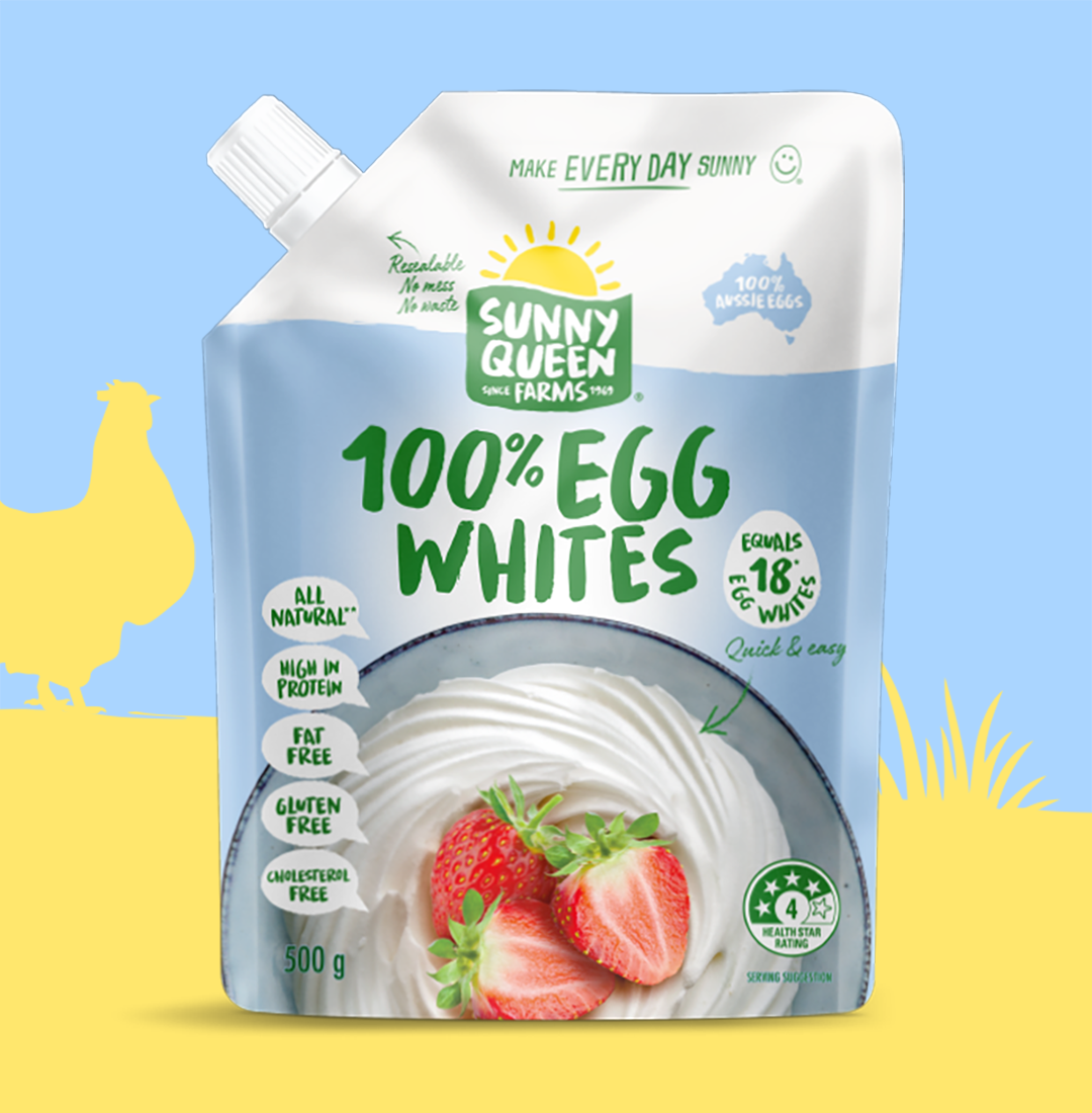

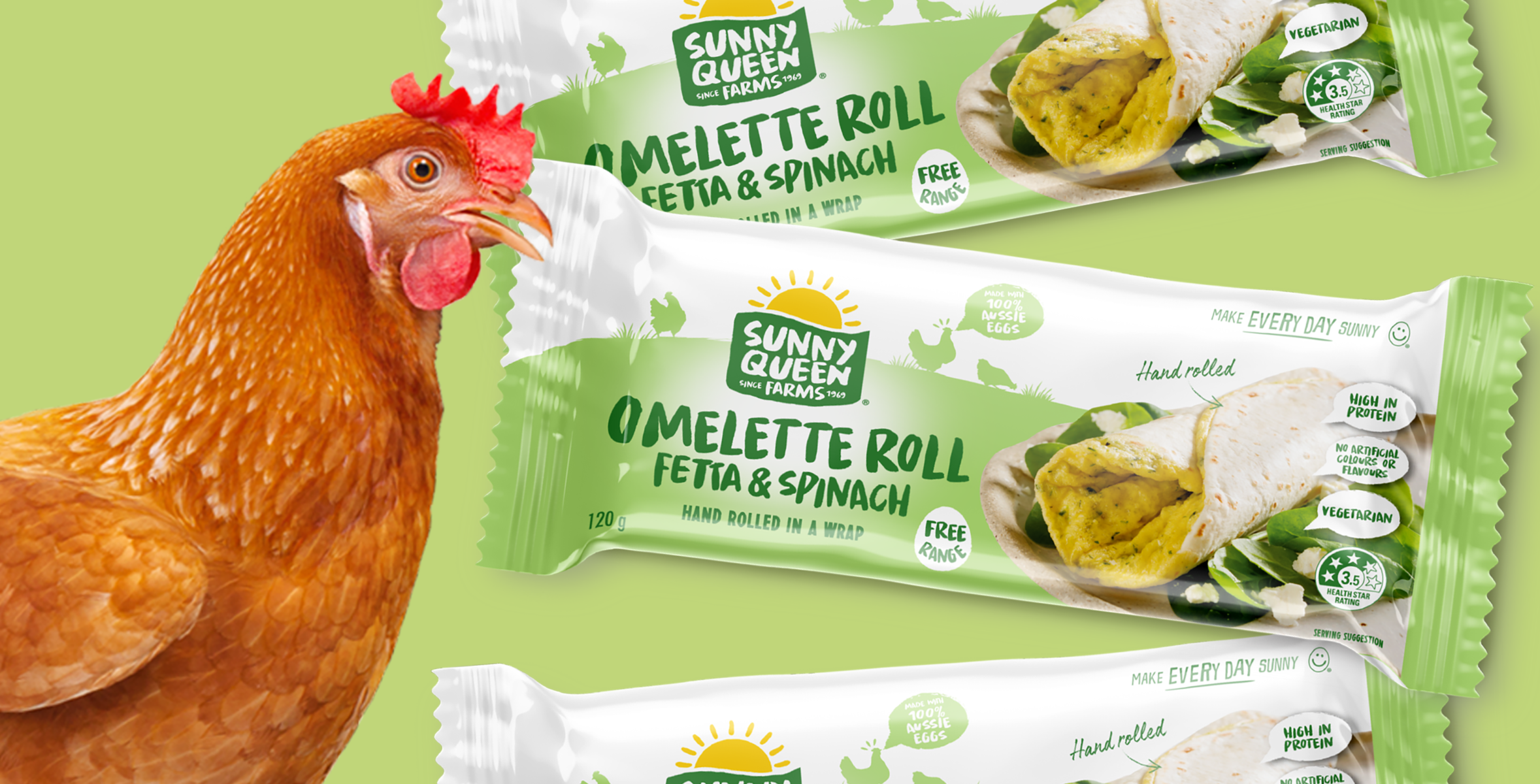
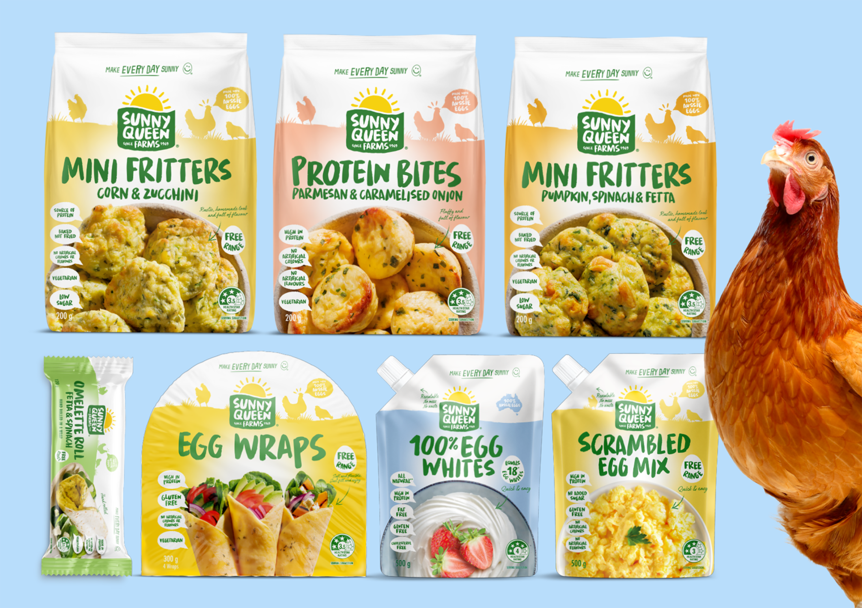
BRAND ARCHITECTURE
Neon created an architecture to align all new products in the portfolio – a fresh new design which becomes a consistent look and feel within the supermarket freezer and yet allows for clear differentiation within the range.
The new designs were positively received by Woolworths buyers and allowed Sunny Queen to enter the frozen goods aisle.
Sunny Queen Architecture Project
• Strategy
• Design
• Packaging